
Suisse Architecte
Brand identity
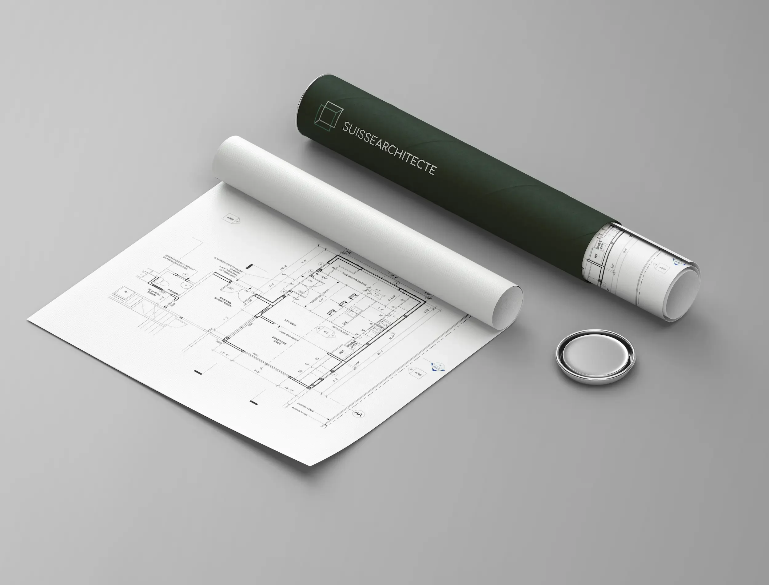
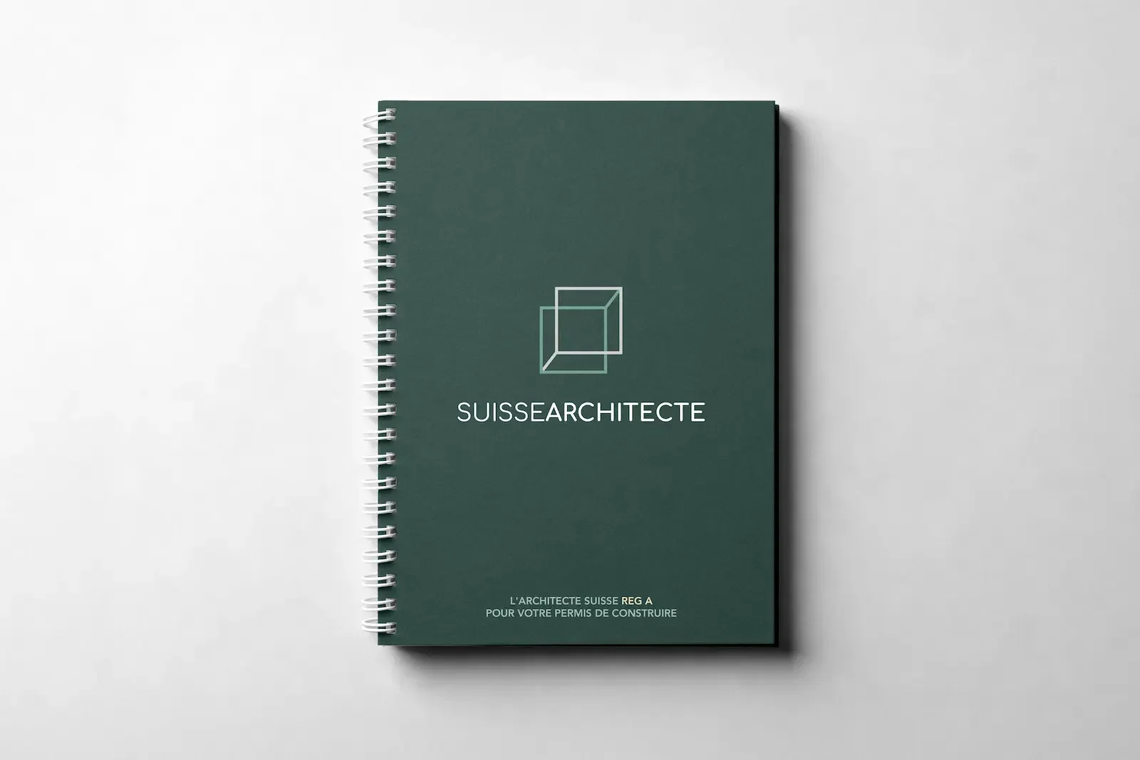
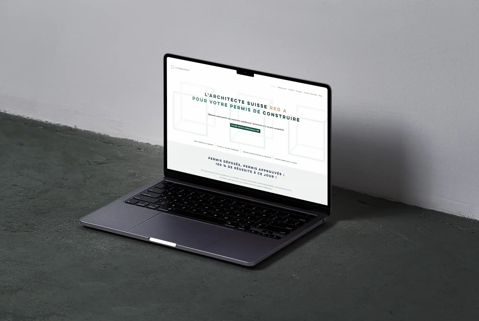
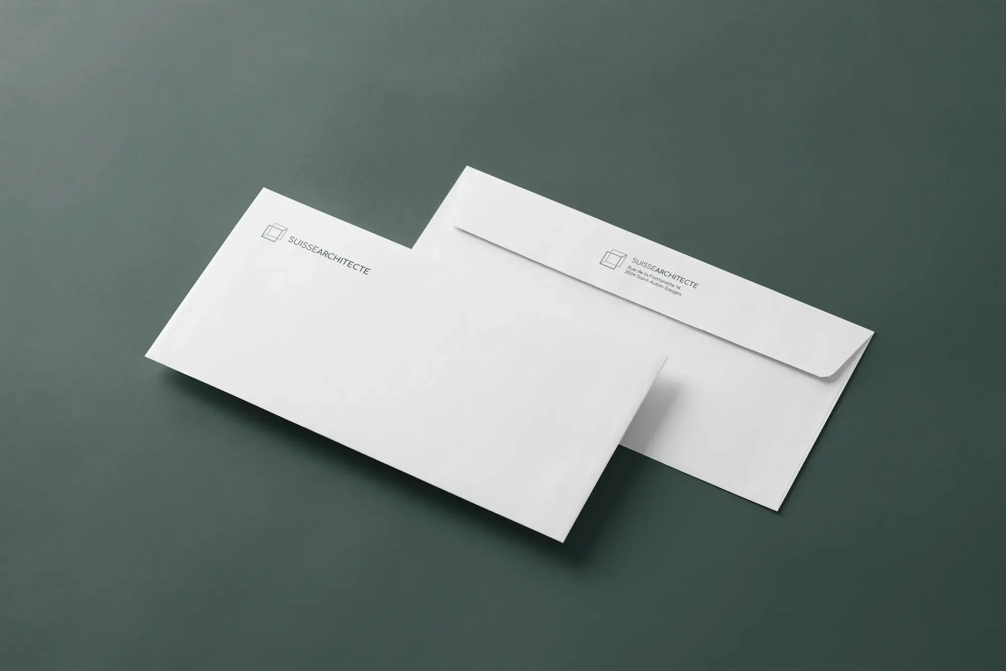
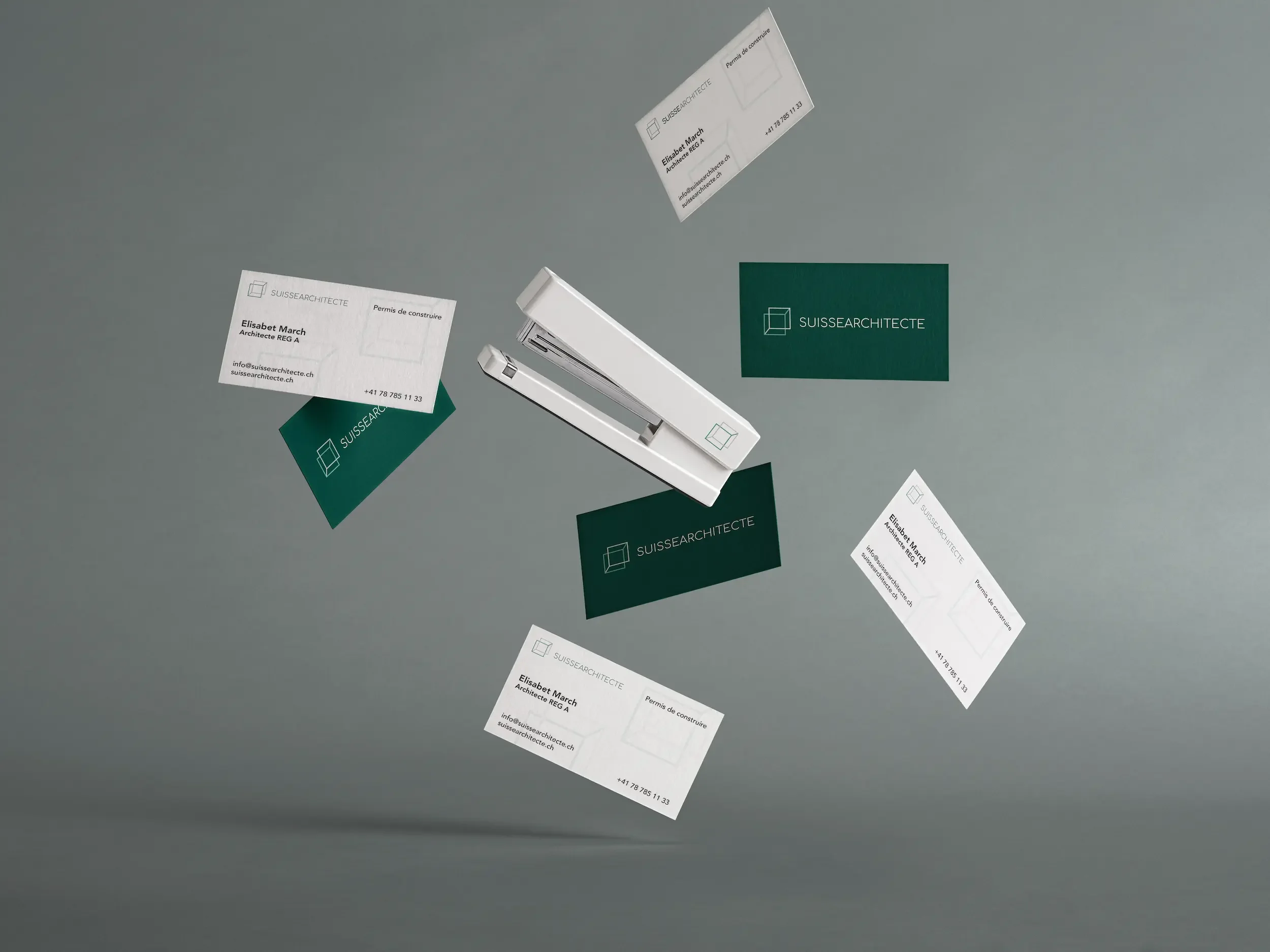
Brand identity for Suisse Architecte, a Swiss firm specialising in online building permit services — a technical, expert-led offer that needed an image to match from day one.
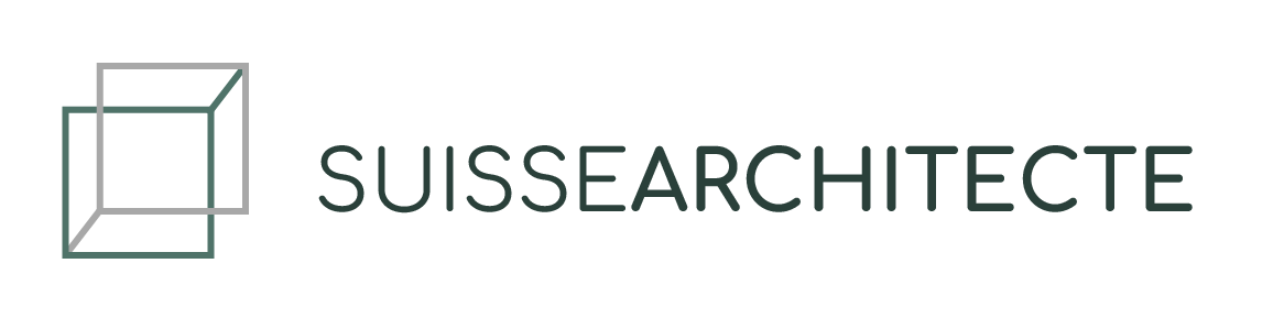
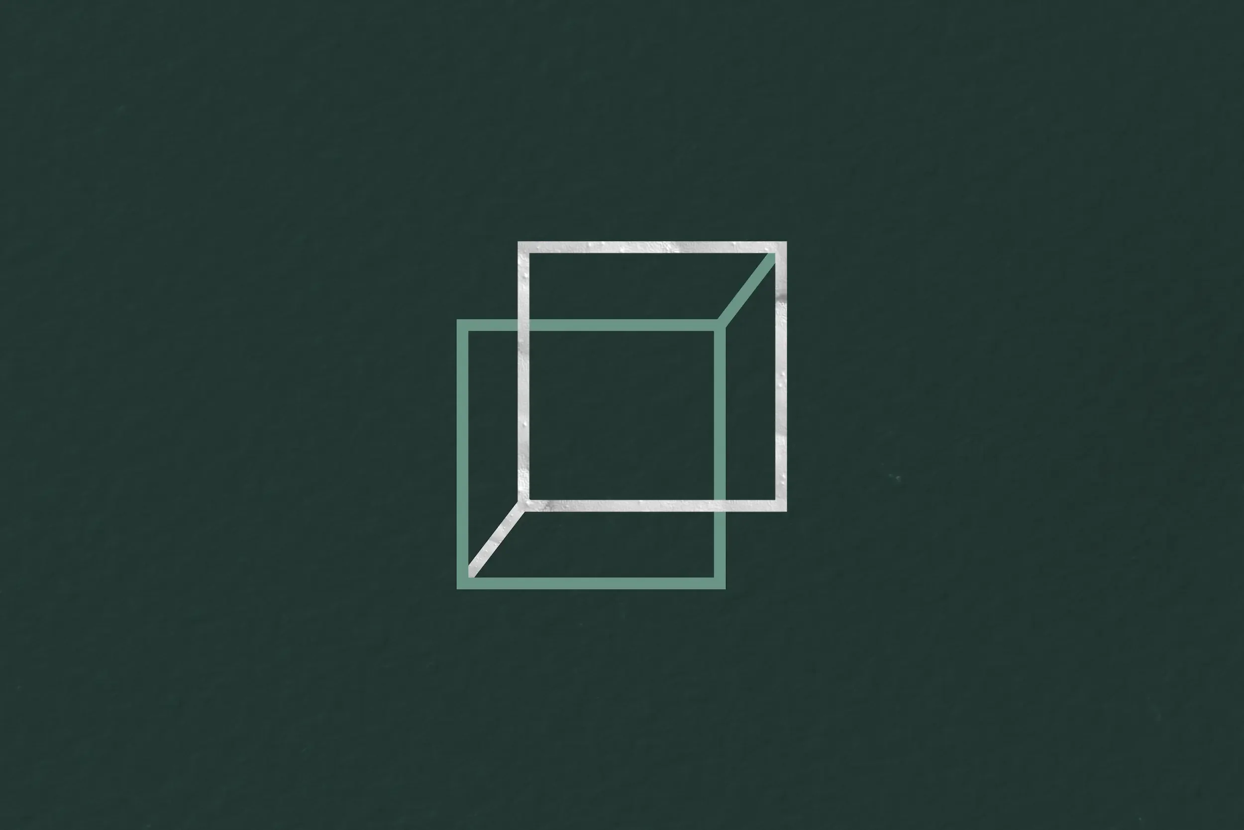
At the heart of the identity is a geometric logo conceived as a metaphor for construction itself: two interlocking squares forming a cube in the making, evoking foundations, structure, and the precision the work demands.
The interconnected forms create a subtle optical illusion — a detail that holds attention without ever compromising the overall restraint of the design.
The colour palette is grounded and understated, communicating reliability and professionalism while retaining a quiet elegance that sets the brand apart.
Deliverables: complete brand identity — logo, brand guidelines, colour palette, typography system.
Some words about this collaboration
Salt & Sun designed the logo for our architecture firm, and we are extremely satisfied.
Leonor understood the essence of our business from the very first stages and gave us sound advice to refine our image. Her expertise and attentiveness led to a result that perfectly reflects our vision.
We highly recommend working with her for quality creative projects.
— Elisabet Álvarez, Founder at Suisse Architecte
Ready to start your project?
Your next chapter deserves the right look.
Drop us a line and let's figure out if we're a good fit.